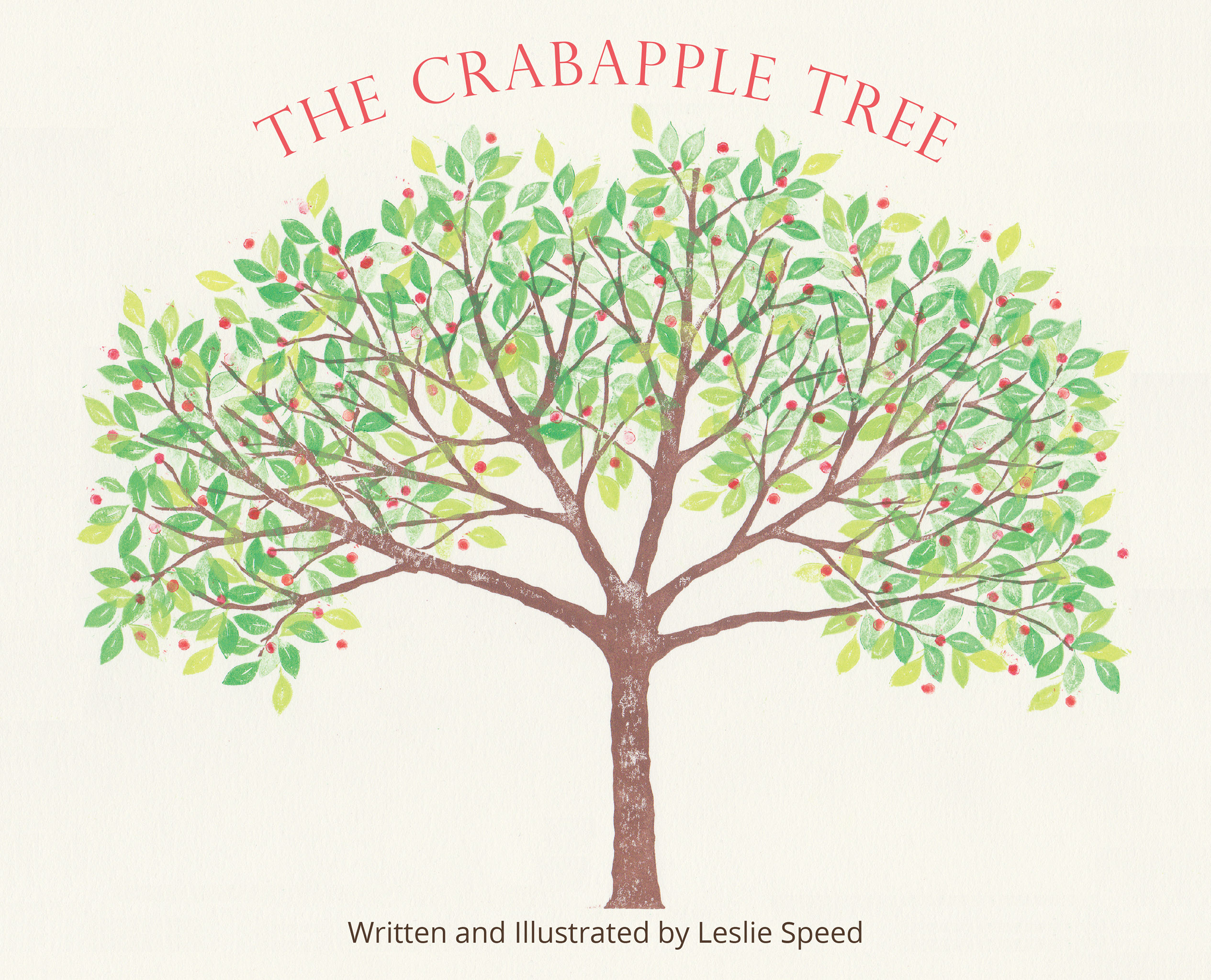
“Growing up in the countryside I found much joy being outside in nature all year round. When I was a child I wrote a poem about our crabapple tree and the life that surrounded it. I loved to see the tree change throughout the seasons. Twenty years later that poem inspired me write and illustrate this book.” ~Leslie Speed
This project’s brief was to format the artist’s delightful lithographs and story for the book and make them press-compliant for a print run.
The design brief, working in collaboration with Behind the Book, included designing this book’s inside pages, and a fixed layout eBook compatible with Kindle devices as well as other eBook platforms.
In The New Dreaming, Sarah Foster shares the stories of fifteen Elders and Knowledge Keepers from around the world as they express their relationship with nature, ancestral teachings and traditions, language, and a personal message to all children of the Earth. Through these diverse voices and worldviews, readers will experience a beautiful variety of geographical places, cultures, and communities while discovering the universal connections that unite us all.
This privately published book contains letters written during a span of 14 years between 2004 and 2018 to three recipients in China who wanted to improve their English languages skills in general as well as in relation to their hobbies or areas of professional expertise and specialization.
The brief for this project included the cover design and page designs for a complex text that includes Chinese characters, the Greek alphabet, Germanic Runes and other symbols, as well as creating the black and white diagrams throughout.
6 × 9 inches
ISBN: 978-1-7773586-0-0
256 pages, including four colour photos and several illustrations
The small crew of the Starship Intrepid, with its newly developed and untried experimental computers and faster-than-light engines, head into space and are led to the planet Nyanga by a mysterious radio beacon emanating millions of miles away. After a perilous landing on the planet, they discover two civilizations, one under the dictatorship of an evil, all-powerful entity ruling the city and its people, while the other lives peacefully and harmoniously with nature. Danger, feints and double-crosses await John, a former Scout Service spaceship pilot, and his crew mates, Brian, a Space Merchant Corp veteran and owner of the Orion’s Belt Bar, along with Susan, the executive secretary to an eccentric billionaire, on the roller coaster adventure of a lifetime.
Cover and page design, layout, typesetting, and reflowable eBook production by Jan Westendorp/Kato Design and Photo.
Vancouver’s Women in Blue is a chronicle of the names and histories of women who served in the Vancouver Police Department; from the first appointment of a woman to the VPD in 1904—who was hired to provide care for female prisoners—to 1975 when Canadian laws mandated gender equality for recruiting and hiring standards. Although many challenges remained for women serving in the VPD, the new law saw the end to the department’s Women’s Division and set the course for women to serve as fully operational police officers. Carolyn Daley, who spent 28 years in the force and reached the level of Deputy Chief Constable, reveals many of the gender-based double standards that women in the VPD often faced and takes readers through the historical transformation of the VPD into a more gender-friendly era.
Front cover of 12 x 9-inch edition; with Chicago Posts.
Half title in both editions, with artist’s chop. Translation: woman photographer
Front cover of 6 x 8-inch edition
Vancouver artist Kiku Hawkes released two editions of her book, Gold Mountain Tableaux: epigraph in conjunction with a studio gallery exhibition of the same title in the 2018 Capture Photography Festival, Metro Vancouver’s high-profile celebration of local and international contemporary photography.
Gold Mountain Tableaux: epigraph presents the second iteration of the artist’s on-going Gold Mountain Tableaux project. It consists of photos Hawkes made in the early 1980s, documenting buildings and streetscapes in her Strathcona neighbourhood. She was prompted to do so by the rapid changes that were taking place—wanting to capture the essence of the area before its irrevocable transformation.
The first iteration of Gold Mountain Tableaux, consists of 42 toned and hand-coloured portraits of Strathcona and Chinatown residents that Hawkes made during this same time period. Book editions are also planned for the portraits.
The 12 × 9-inch limited edition is printed on archival Mohawk Superfine Eggshell cover and text stock; bound with Chicago Posts, which allow for the insertion of additional pages as the artist expands upon Gold Mountain Tableaux.
The 8 × 6-inch perfect-bound edition is for broader distribution.
In addition to the artist’s introduction, the text includes a foreword by Andy Yan, a native of Strathcona and director of the City Program at Simon Fraser University, and “sing, chickadee, sing” a poem written especially for this book by acclaimed poet and long-time Strathcona resident, Daphne Marlatt.
Kiku Hawkes’ work has been exhibited across Canada and won international awards in art and commerce.
To purchase the artist’s books or hand-printed archival photographs please inquire at jan@katodesignandphoto.ca
Passfield Press is a literary press with a mandate to publish titles primarily by author Michael Hetherington. In affirmation of its tagline, generative disturbances at the margins—writing on the edge, three Passfield Press titles have been singled out for awards, including a Gold Medal.
The design brief for the four books on this page included making unique and distinctive covers as well as interior pages. Covers are finished with a soft touch laminate (featuring a scuff-resistant, nylon-based matte-laminate) for extra durability.
Gold Medal for Canada West Fiction: Independent Publisher (IPPY) Book Awards And Finalist—literary fiction: Foreword Reviews’
INDIEFAB Book of the Year Awards
The Playing Card
Another international book award winner! Criteria for the IPPY Gold Medal Award include design-related elements: first impression, cover design, and interior layout.
The Playing Card, is Michael Hetherington’s first novel, following two previously published books, including The ArchiveCarpet, which is composed of fiction fragments. (The Archive Carpet)
The Playing Card is about curiosity and the pursuit of knowledge; at the same time, it’s a playful, suspenseful, and experimental novel—a metaphysical mystery. The structure of this book is unique, based on a deck of 52 playing cards in four suits. It includes 52 chapters in four parts, along with two “joker” chapters and an “Inface,” a kind of preface set in after the first three chapters.
The cover features a painting by renowned French painter, Henri Matisse; with permission from his estate. Interior pages have chapter headings that push outside the body text margins; and page numbers vertically aligned to chapter headings, although these are set approximately one-third of the way down the page.
Finalist in Foreword Reviews’ 2014 INDIEFAB Book of the Year Awards.
Halving the Orange
The dark mystery behind Isabella’s confinement unravels slowly amidst quirky characters and intellectual hijinks. Who can she trust? What really happened to her mother? The truth comes at a high price, and in the end, Isabella must make a life-altering decision.
The cover features a painting by English Pre-Raphaelite painter, John Everett Millais; courtesy of National Museums Liverpool. To support and echo the novel’s setting at a medievalist college, chapter openings have an attractive ornamental filigree drop cap. The text font, which was originally intended for use in hand-setting limited edition books, is elegant, sophisticated, highly readable, and a beautiful match with the ornamental chapter openings.
Late one night when Adrian is nineteen, he risks climbing up into the green tower that operates the railway bridge spanning Vancouver’s Burrard Inlet. There, he encounters a mysterious naked woman who will haunt him for years to come. An undercurrent of violence and danger flows beneath the story, threatening to pull Adrian down out of his innocent existence into dark and murky depths.
Analogous to the dark and unnerving undercurrents throughout this novel, the cover features a distressed font and spine details. The old dock at Jericho Beach represents one of its main place settings. On the interior pages, heavy blocks at the chapter openings and the “spikey” text font further reflect the novel’s themes.
The author wrote fragments of fiction every day for 2500 days and later selected 600 for publication. The result is The Archive Carpet, “. . . a wild and wonderful ride over lands that are sad, funny, absurd, and scary.”
This is fiction, although the writing has a poetic quality. That meant the design challenge was to create an elegant book whose contents are arranged in 39 “chapters” aggregated into three parts. This required clear levels of hierarchy and plenty of white space to create smooth flow while also allowing each element to breathe and declare itself.
In response to the author’s desire to include in the Table of Contents (TOC) all fragment titles, plus chapter titles and parts opening pages, the TOC is set in two spacious columns, with page numbers shown only for the chapters. The result is a clean and uncluttered look, allowing easy navigation for the reader.
The design brief, working in collaboration with Behind the Book, required a bold cover to support the novel’s compelling narrative, interior page design for easy readability, and an ebook compatible with all e-readers.
“Norm Cuddy’s Return of the Jaguar skillfully takes the reader on a thrilling and perilous journey across the Baja desert and into the mountainous jungles of Chihuahua, weaving a gripping story around the carnage that took place in Chiapas.”
Norm Cuddy’s widow found in his desk drawer the completed manuscript for Return of the Jaguar several months after he passed away. With the help of author services company, Behind the Book, she completed the final copy edit and fulfilled Norm’s vision of publishing his spell-binding novel.
Invitation to Beauty is an engaging book that combines poetic verse meditations with colourful photos to provide guidance for experiencing more beauty in life. Together the meditations and photos speak of beauty’s depth and varied dimensions: the idea of beauty as a sanctuary; the grace that boldness, liberty, and forgiveness release into our lives; beauty’s power to affirm and renew. Let the interplay of images and words relax and inspire you while illuminating a path to a rich, satisfying life.
Enabling its author to achieve the most effective sales at her workshops and presentations, this book is published in a traditional print run. And to maximize distribution it is also available in print on demand editions.
A 64-page ABC book for kids and adults, alpha bones candy, features Modern Tanka poems that are short, musical and humorous; black and white illustrations you can colour; and objects you’re invited to search for in each illustration. Poems and illustrations encourage hugging moments for reader and child. This book is a whole lot of fun!!